Composition Analysis
This document explains how to use Composition analysis in the Moesif’s User and Company Analytics suite.
Moesif supports Composition analysis for both Users and Companies. Unless this document states explicitly, it uses the term user to represent both Users and Companies for simplicity.
Overview
Moesif’s Composition analysis allows you to understand your user base by breaking them down into segments and groups. Instead of events, you break down the data based on user properties. This gives you a deep look into your user distribution from different point of views, allowing you to identify important trends and strategize accordingly.
Before You Start
Events may take up to 20 minutes to show up in the user analytics screens. If your data has not appeared, make sure you wait until Moesif has completed the instrumentation process and loaded the data.
Set up a New Composition Analysis
To create your own Composition analysis, follow these steps:
Step 1: Create a New Composition Analysis Workspace
You can create a new Composition analysis workspace in two ways:
From the Create New Dialog
- Log into Moesif Portal.
- Select + Create New in the navigation menu.
- Select Composition for Users or Companies.
From Users or Companies Screen
- Log into Moesif Portal.
- Select Users or Companies in the navigation menu.
- Select Composition from the dropdown menu.
Step 2: Select User and Event Filters (Optional)
You can go really low-level and fine tune your Composition analysis by selecting user and event filters. This lets you filter your Composition chart by specific user properties like location, or by specific events that users have performed.
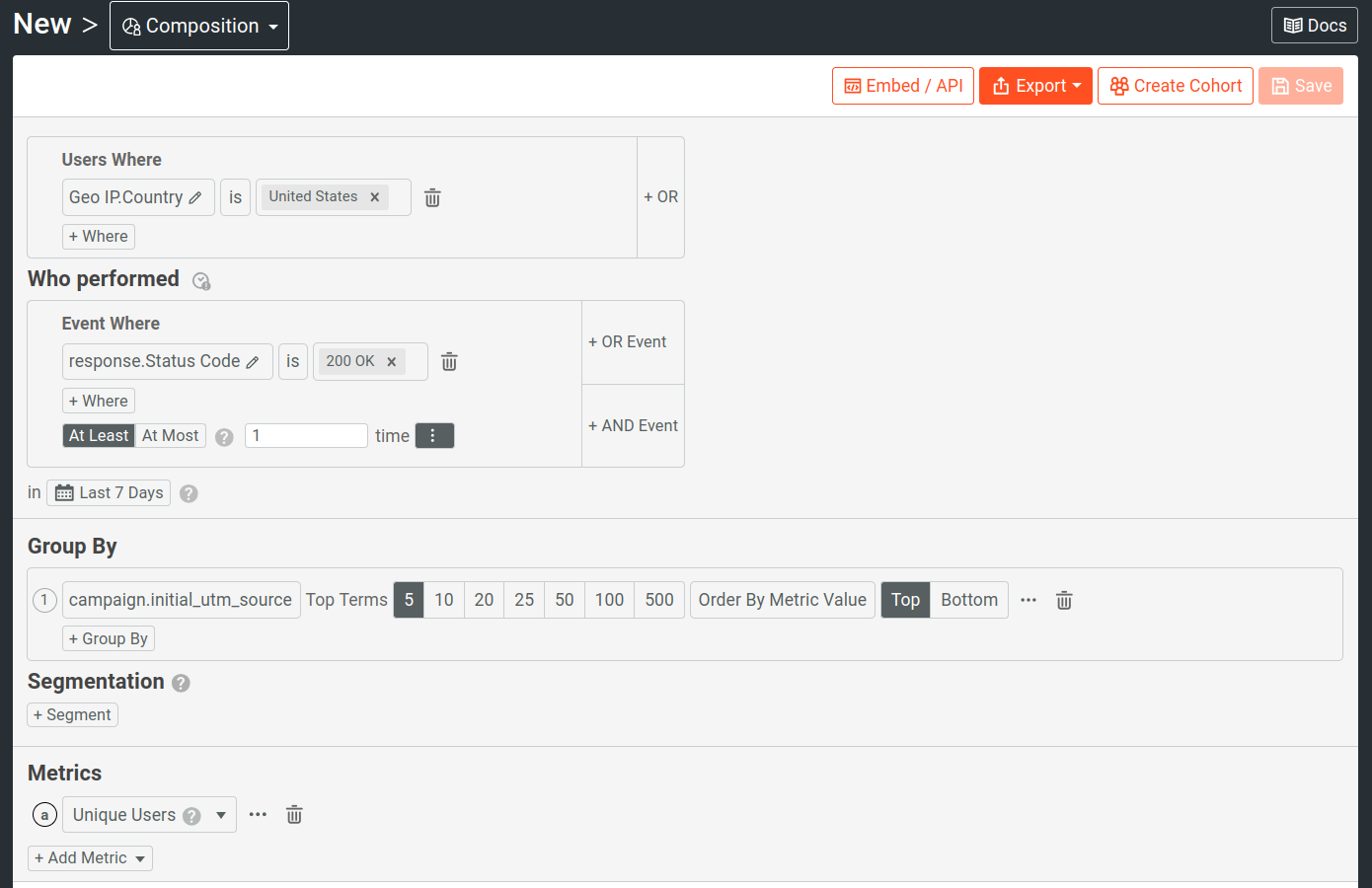
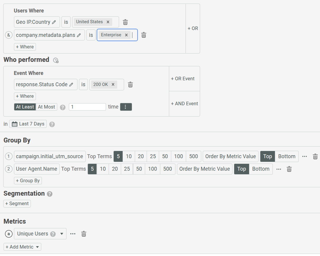
See the example where it selects one user filter and one event filter to narrow down the composition analysis data.
Step 3: Select the Breakdown Criteria
Next, select the user properties you want to use to break down the chart. The example in the next section selects the initial UTM source as the breakdown property.
Step 4: Select the Metric
Lastly, select the metric you want to plot in the Composition chart based on the user property and filters you’ve defined in the preceding steps. You can plot more than one metric in the chart.
Moesif offers several predefined metrics. If these predefined metrics don’t suit you, you can define custom metrics.
Example
Let’s consider the following requirements for a composition analysis:
- Unique customers from the United States. Unique means we want to exclude anonymous visitors and only include users with identified user IDs.
- We want to break down the data based on initial UTM sources. This helps understand how users come to know about the product and examine marketing strengths in different platforms.
- Customers must’ve used the product successfully at least once. Let’s measure this by filtering on HTTP
200 OKstatus code. - We want the data for the past week.
Then we can define the user filter, event filter, and breakdown property in the following way:
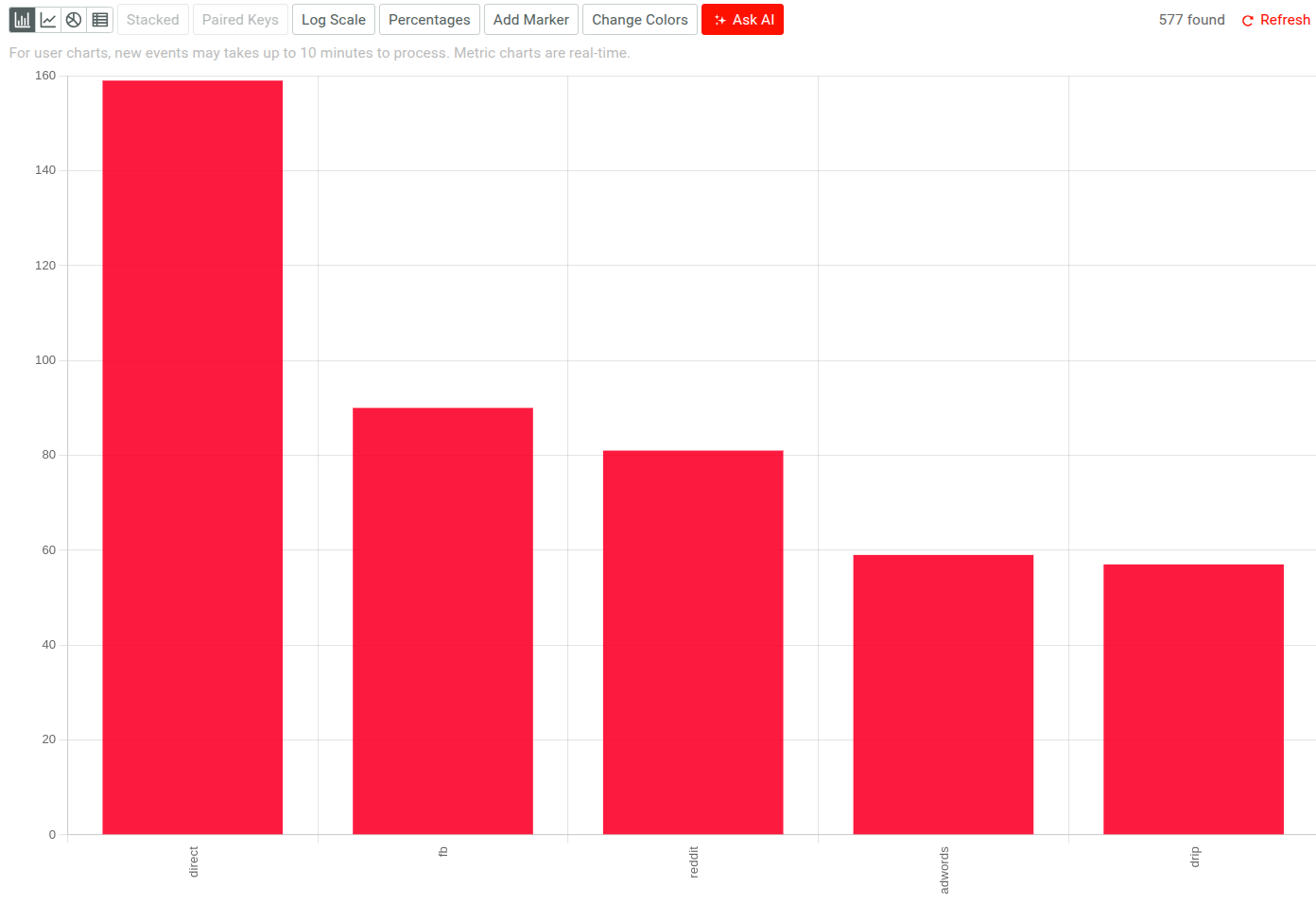
This results in the following composition analysis chart:
The next sections discuss more about the steps you need to follow to build a Composition analysis in Moesif.
Filters
In a Composition analysis, you need to define the data breakdown criteria by selecting one or more user properties. You can go deeper and narrow down the data by selecting from user and event filters. For more information about these filters, see Reference: Analytics Filters.
Configure Groups
Select Group By and then select the property by which you want to break down the data. You can group by user or company metadata, company domain, user ID, and many more. In our example, we select Campaign.initial_utm_source as the user property. This breaks down the chart by sources from where users come from.
You can specify at most three groups at a time. For more than one group, you have two extra chart options to customize the plot. For more information, see Stacking Plots and Merging Groups.
Configure Segmentation
If you want to use your own criteria to segment data by custom groups, use the Segmentation option.
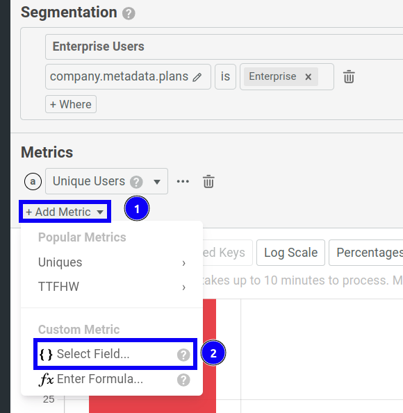
In the previous example, let’s say we want to see the number of Enterprise plan users. To do so, we select + Segment and then select Company.Metadata.plans from the Select Field list. This results in the following chart.
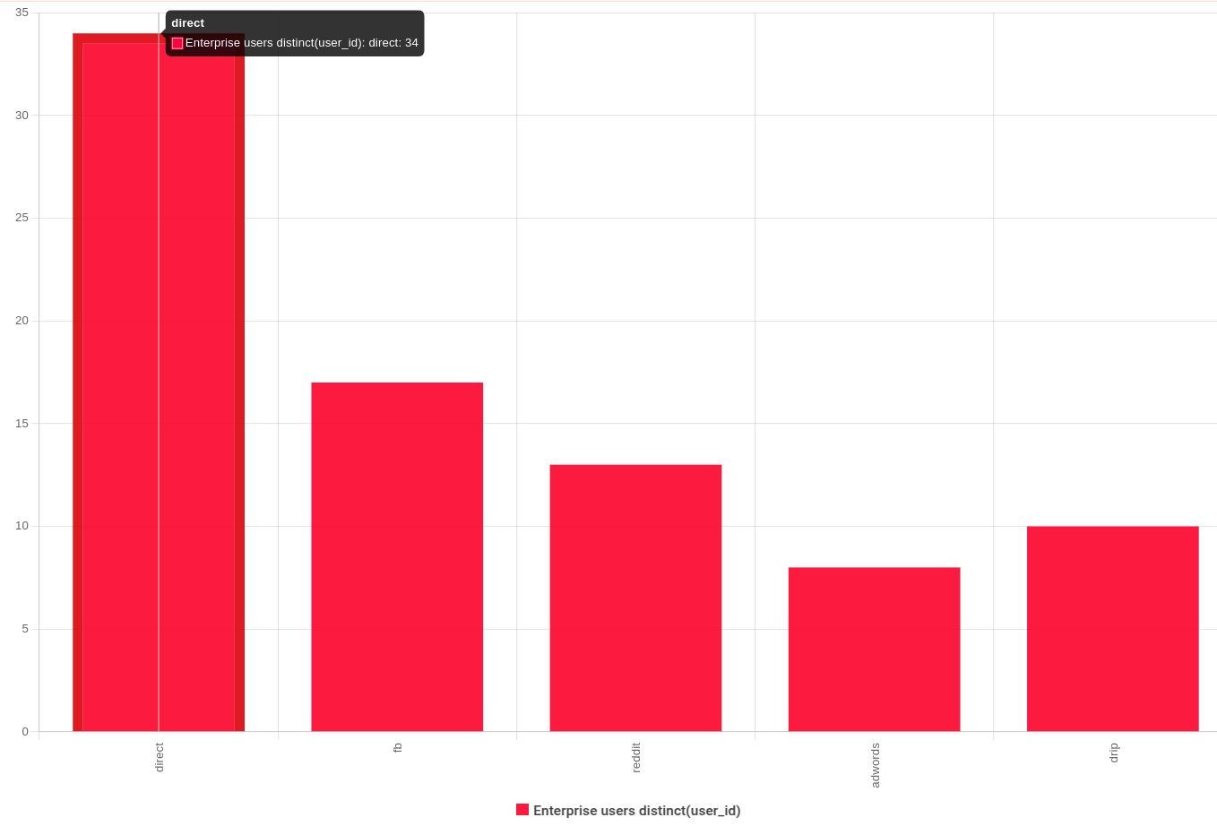
It still shows the number of unique users from the last week in the United States and breaks down the data into the UTM sources the users came from. But now, we have a breakdown of unique users who are subscribed to the Enterprise plan.
After selecting + Segment, Moesif generates a unique name for the segment that you can change—for example, segmentcd635fbb. In the preceding example, we entered the name Enterprise Users. You can reference this name when you define a custom metric formula.
Configure Metrics and Chart
You can specify, configure, and visualize a composition analysis metrics in different ways.
Select the Metrics to Plot
By default, Composition plots only the Unique Users metric. You can always plot more than one metric in the same chart by selecting + Add Metric.
The following predefined metrics are available:
- Unique users: number of unique users, including both identified users with identified user IDs and anonymous users
- Unique identified users: number unique users, including only users with identified user IDs
- Unique companies: number of unique companies with company IDs
- Unique company domains: number of unique company domains
- Unique sessions or keys: number of unique session tokens or API keys
- Average TTFHW: the average time to first hello world (TTFHW) metric
- Maximum TTFHW: the maximum time to first hello world (TTFHW) metric
You can also add custom metrics by selecting a new data field or specifying a custom formula that references other metrics.
Create Custom Metric
You can create custom metrics in two ways:
- Add another data field and specify how to compute the metric from the field.
- Add a custom formula that computes a metric from other metrics.
Add Another Data Field
- Select + Add Metric and then select { } Select Field.
![Add custom metric by selecting a custom field in a Segmentation chart]()
- Select an event field from the Select a field list.
-
Select a computation method for the values of the event field.
The computation methods available depend on the data type of the field. For example, numeric types have the following computation methods available:
avgminmaxpercentilesdistinct
Add a Custom Formula
Moesif allows you to create a custom arithmetic formula to use the values from other metrics or segments that you’ve defined.
Moesif assigns a unique letter to each metric you plot. You can then reference those letters to build an arithmetic expression that computes a custom metric. You can also refer to segments in the custom formula as well by using the segment name.
The following example defines the custom metric formula b/a where a corresponds to a Unique Users metric and b corresponds to an Average TTFHW (time to first hello world) metric.
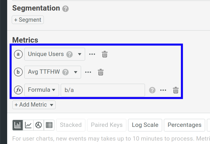
To use segments as part of your formula, use the syntax SEGMENT_NAME.METRIC_LETTER.
For example, if you have two segments API and All, and a metric a, you can define the formula (API.a/All.a)*100.
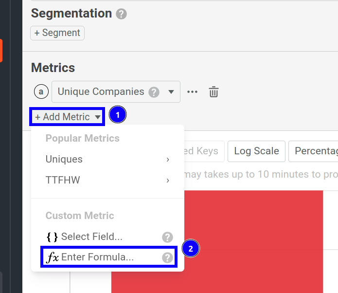
To add a custom formula and plot its metric, follow these steps:
- Select + Add Metric and then select Enter Formula.
![Creating a custom formula in a Composition chart]()
- Enter your formula. The following operators are supported for a formula:
- Addition
(+) - Subtraction (
-) - Division (
/) - Multiplication (
*) - Exponentiation (
^) - Square root (
sqrt) - Natural logarithm (
ln,log) - Base-10 or common logarithm (
log10) - Base-2 or binary logarithm (
log2)
- Addition
Change Chart Style
You can change how Moesif plots segmentation charts and toggle from one style to another. This allows you to view the metrics in multiple ways.
The following styles are available:
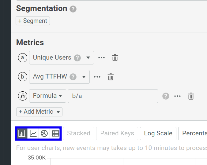
Bar Chart
A bar chart represents data with rectangular bars. The height of each bar corresponds to a quantity of the metric data and each bar belongs to a category. The categories come from the grouping you specify and each bar represents a single category. In the example Composition analysis, we plot the Unique Users metric in a bar chart and group the data by UTM sources. Therefore, each bar represents data for a UTM source like Facebook and LinkedIn. The height of each bar changes in proportion to the number of unique users associated with a UTM source.
Line Chart
A line chart plots your metrics by connecting the data points with lines. Each data point represents a value of the metric at a specific time period. Line charts help you visualize and understand how metrics change over time.
Pie Chart
Pie chart uses a circular graph to represent how a total amount of your data is divided into categories. Each radial portion of the chart corresponds to the amount that belongs to a category. Pie charts help you visualize how each category or group contributes to the entirety of your data. For example, a pie chart can help you visualize how your customers are using your products across different countries and regions.
Table
The table view shows the metrics data in a tabular format, similar to a spreadsheet.
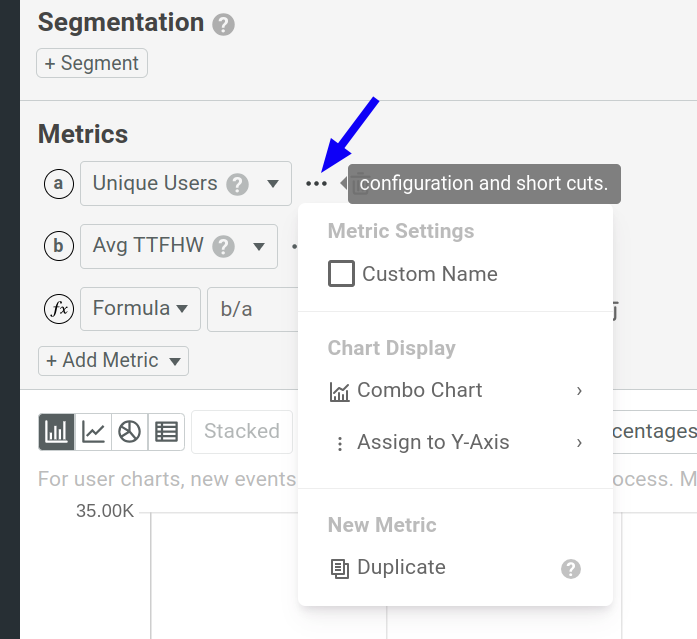
Metric Configuration and Shortcuts Menu
For each metric in the Metrics pane, select ⋯ Configuration and Shortcuts to further customize your chart.
Custom Name
Select the Custom Name checkbox to set a custom name for the metric.
Combo Charts
A combo chart combines line and bar charts. Combo charts allow you to represent multiple metrics in the same chart for better visualization and comparison.
To create a combo chart, open the ⋯ Configuration and Shortcuts menu and then select Combo Chart.
Customize Vertical Axis
When you have more than one metric in a chart, you may want to use independent Y-axes for each. Metrics on separate Y-axes can vertically scale independently of one another within the same chart. This proves useful in scenarios such as comparing values at very different scales.
To use a different Y-axis for your metric, open the ⋯ Configuration and Shortcuts menu and then select Assign to Y-Axis. The following Y-axis types are available:
- Y-Axis A
- The default Y-axis.
It’s always on the left side of the chart. If you select a different Y-axis for a metric, the Y-axis appears on the right side. When you select the Log Scale option, it only affects this default Y-axis.
- Y-Axis B
- Expresses a metric with a decimal ratio as a whole number percentage—for example,
0.5as50%. This axis multiplies the values by 100 and adds a percentage sign to the chart units. - Y-Axis C
- Adds a new Y-axis on the right side of the chart based on the metric values.
- Y-Axis D
- Adds a new Y-axis on the right side of the chart based on the metric values.
Duplicate a Metric
Select Duplicate to duplicate the corresponding metric in the same chart.
Stacking Plots
You may have multiple groups that you have used to break down your data. Then you can combine the group plots by stacking them on top of one another. This generates a more composite visualization of your composition data.
In our example composition analysis, let’s change it so that we also get a breakdown of Enterprise users based on the SDKs they use to interact with the API. To do that, we define the filters and chart settings the following way:
We can now select Stacked to generate a stacked chart.
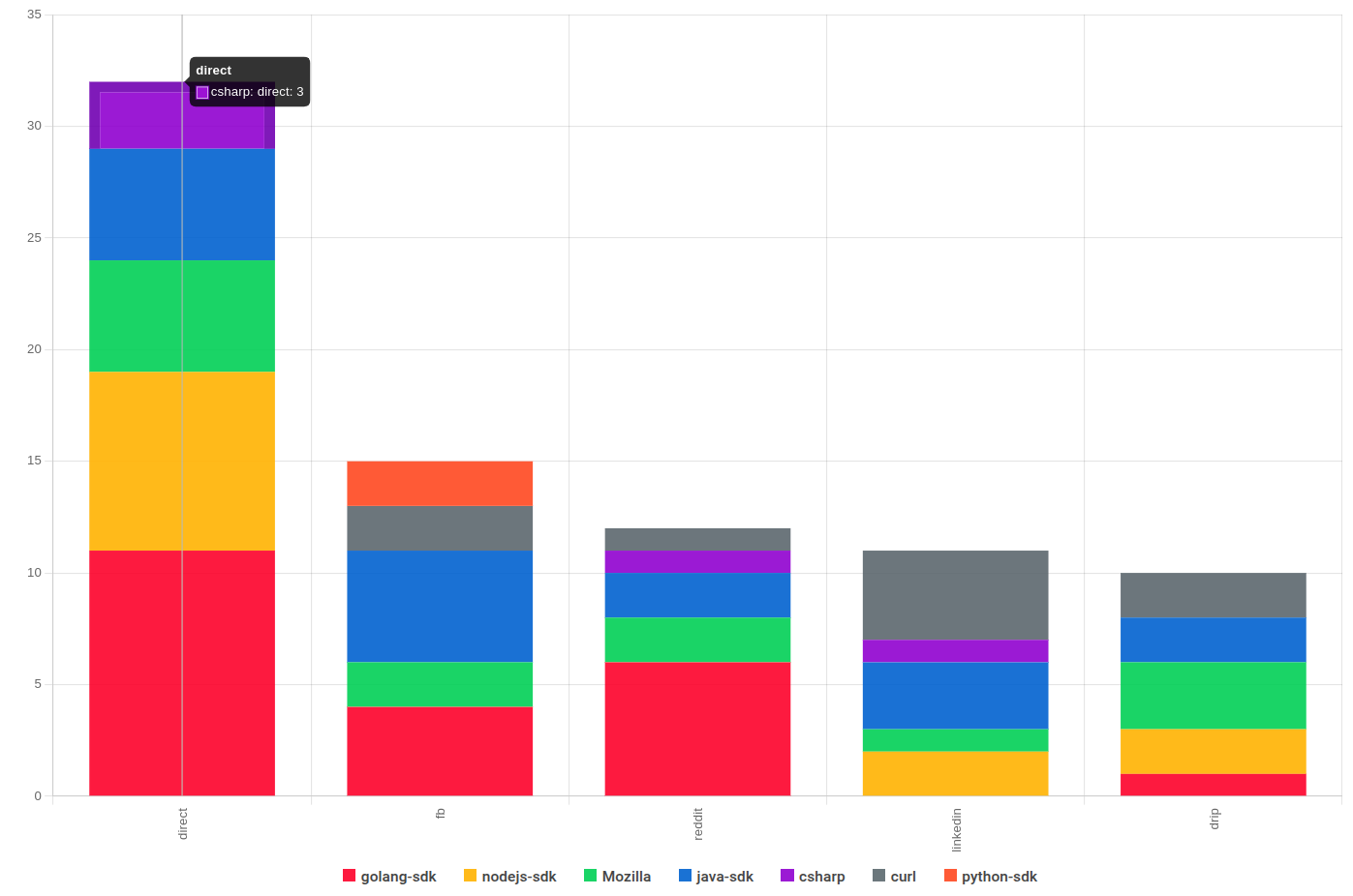
Without stacking plots, the chart looks like this, with several bar plots representing different SDKs:

Merging Groups
Similar to stacked plots, if you have more than one group, you can merge two groups into a single key by selecting Paired Keys. If you have sparse data, this can help you generate better visualizations.
AI Explain : Use AI to Get Insights About Composition Analysis
AI Explain gives you an AI-powered conversational interface where you can ask questions and gain insights about retention analytics data.
In a Funnel workspace, select Ask AI to open up the interface. To get started, you can choose from the sample prompts. Otherwise, type in your query and press Enter.
Save and Share
Moesif gives you several options to share a Composition analysis workspace. Before you can share, you must first save the workspace to a dashboard.
After saving, follow the instructions in Sharing Workspaces to share your workspace.
Download Chart Data
You can download your Composition analysis data in CSV format for further processing in tools like Microsoft Excel:
- Select Export.
- Select Download Chart - Current View or Download Chart - All Terms.