Billing Report Metrics
Billing Report Metrics gives you aggregated metrics on billing reports history within a specific timeframe of your choice.
Overview
Billing Report Metrics gives you a consolidated interface to dig deep into metrics about your existing billing meters and visualize them. It allows you to achieve the following with ease:
- Understand aggregated usage and financial flows.
- Save time and resource by avoiding manual auditing of meters or companies for a specific piece of information.
- Quickly find active meters so you know what meters are reporting data. This allows you to debug faster—for example, reporting issues with specific meters.
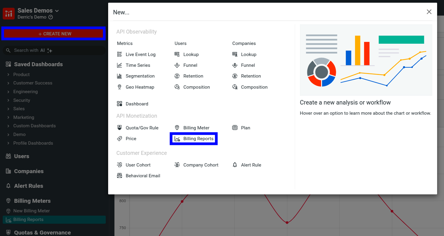
Access Billing Report Metrics
To access Billing Report Metrics, follow these steps:
- Go to your Moesif Web Portal.
- Select Billing Meters in the navigation menu.
- Select Billing Reports.
Alternatively, select + Create New in the navigation menu and then select Billing Reports from the API Monetization section.
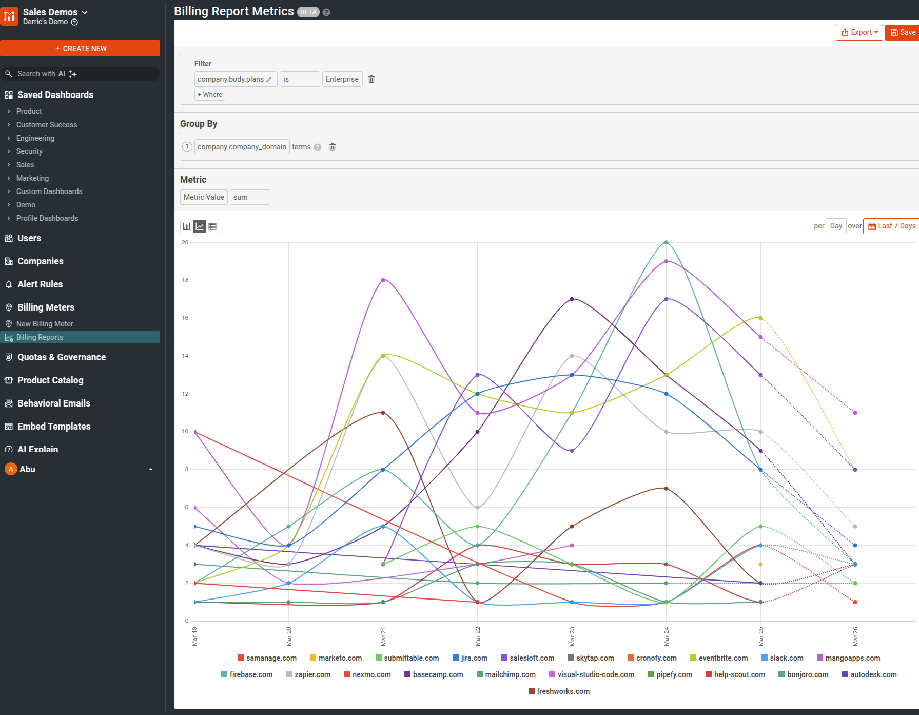
Specify Filters
In the Filter pane, filter the reported usage or amount by selecting one or more billing meter data fields.
The following table describes the available filters.
| Filter name | Description | Example |
|---|---|---|
| Company filters | ||
company.geo_ip |
Filters by the company's geographic location data like city name, timezone, and IP. | New York |
company.user_agent |
Filters by various user agent data. | Mozilla/5.0 |
company.metadata |
Filters by various company metadata. | industry: SaaS |
company.cohort_history |
Filters by cohort history data. | SignedUpLast30Days |
company.cohort_info |
Filters by cohort data. | EnterpriseUsers |
company.campaign |
Filters by HTTP Referer data and various UTM parameters. |
utm_campaign=launch |
company.balance |
Filters by the company subscription balance. | example.com |
company.cohort_ids |
Filters by the IDs of the cohorts the company is a member of. | NonEnterprise Customers |
company.cohort_names |
Filters by the names of the cohorts the company is associated with. | NonEnterprise Customers |
company.cohorts |
Filters by cohort data. | EarlyAdopters |
company.company_domain |
Filters by the company's domain name. | example.com |
company.company_id |
Filters by company ID. | 0NFM-FAB8-O0S9 |
company.email |
Filters by company email. | Quinn.A@github.com |
company.initial_ip_address |
Filters by the initial IP associated with the customer when they made the very first API call. | 47.188.89.92 |
company.initial_request_route |
Filters by the API endpoint the user sent their very first request to. | /api/train/model |
company.ip_address |
Filters by the associated IP address of the company. | 47.188.89.92 |
company.jwt_token |
Filters by JWT token. | eyJhbGciOiJI... |
company.name |
Filters by the company's name. | Example Inc. |
company.phone |
Filters by the company phone. | +1-800-555-1234 |
company.plan_id |
Filters by the company's plan ID. | ygFVtXL9Q9 |
company.user_agent_string |
Filters by the company user agent string. | python-sdk/1.2.1 |
| Billing meter filters | ||
billing_meter_id |
Filters by the billing meter's unique identifier. | 664fa46e0d3ea057bfb59737 |
billing_meter.name |
Filters by the billing meter's name. | E-Sign Req Volume - Pro |
| Subscription filters | ||
subscription |
Filters by various subscription data. Contains nested filters. For example, if you're using Stripe, you can filter by Stripe Subscription object data fields. | |
subscription_id |
Filters by the subscription's unique identifier. | sub_1QvrEMFM2Whj9NlnHy10bBN8 |
subscription_item_id |
Filters by the subscription item's unique identifier. | si_Ru5ynNkAtVICcA |
| Plan filters | ||
plan.id |
Filters by the plan's unique identifier. | prod_ONCjqbqF720nka |
plan.name |
Filters by the plan's name. | Premium Plan |
plan.provider |
Filters by the plan's provider. | stripe |
plan.status |
Filters by the plan's status for the company. | active |
| Price filters | ||
price |
Filters by various price data. Contains nested filters. For example, if you're using Stripe, you can filter by Stripe Price object data fields. | |
| Additional filters | ||
success |
Filters by the success status of the billing report. | true |
status |
Filters by the status of the billing report. | posted |
type |
Filters by the type of billing report. | usage |
meter_metric |
Filters by the billing meter metric value. | 3 |
provider |
Filters by the billing provider. | Stripe |
currency |
Filters by the currency used in the billing report. | USD |
report_total_usage |
Filters by the total usage reported. | 5000 |
subscription_item_id |
Filters by the subscription item ID. | si_45678 |
Create Grouped Charts
In the Group By pane, you can select billing meter data fields to create a chart that displays values across multiple catagories. For example, you can select provider to break down your metrics across different billing providers like Stripe, Recurly, and so on.
Specify the Metric to Plot
Select the metric value you want to plot in the chart in the Metric pane. The following metric types are available:
Metric ValueAmountEnding BalanceAvailable BalancePending Activity
You can select from the following aggregators for the metric:
summinmaxavg
Specify Time
You can set the period of time you want the metrics of and the interval in the time control dropdowns.
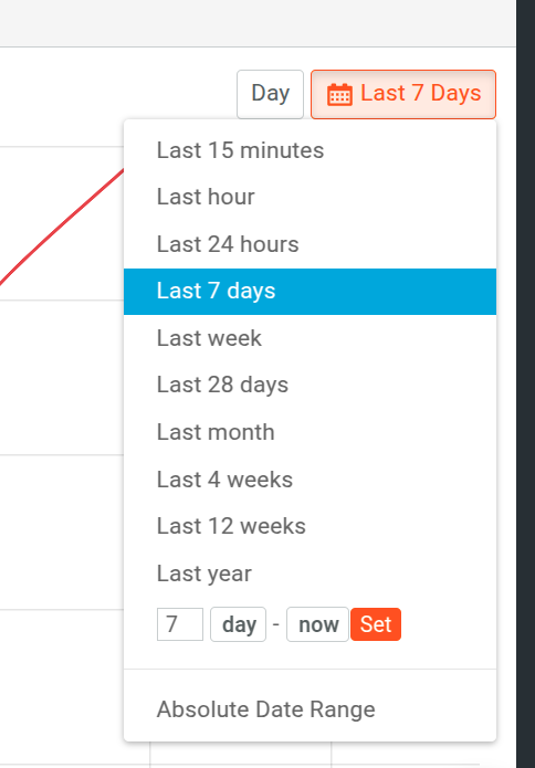
You can select from one of the builtin time spans, for example,
Last 7 days or Last week. You can also specify the interval for the time period—for example, daily or hourly. If you want more precise control, use the relative date range or absolute date range options.
Change Chart Style
You can change how Moesif plots billing report metrics charts and toggle from one style to another. This allows you to view the metrics in multiple ways.
The following styles are available:
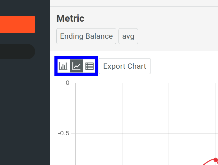
Bar Chart
A bar chart represents data with rectangular bars. The height of each bar corresponds to a quantity of the metric data and each bar belongs to a category. The categories come from the grouping you specify and each bar represents a single category.
Line Chart
A line chart plots your metrics by connecting the data points with lines. Each data point represents a value of the metric at a specific time period. Line charts help you visualize and understand how metrics change over time.
Table
The table view shows the metrics data in a tabular format, similar to a spreadsheet.
Save Chart
Once you’ve finished defining your chart settings, select Save to save your Billing Report Metrics chart.
Export Chart Data
You can export the raw data of your billing report metrics chart in JSON and CSV formats by selecting Export and then selecting As JSON or As CSV. The export adheres to any filters and settings that you have applied to your chart. Therefore, make sure you’ve applied the changes you require before exporting.
For example, here we define a report with the following settings:
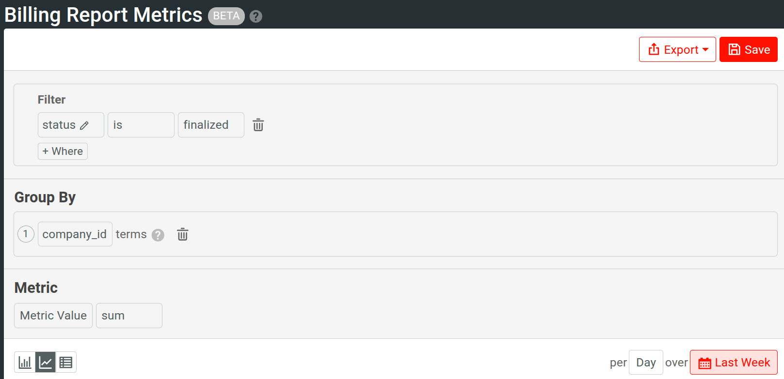
Exporting its data as JSON gives an output similar to the following:
{
  "group_by": [
    {
      "key": "ZPW1-OL8K-4EKB",
      "buckets": [
        {
          "start": "2025-01-27T00:00:00.000+0600",
          "metric": 2,
          "amounts": {
            "USD": 0
          },
          "ending_balance": {
            "current_balance": -8,
            "pending_activity": 0,
            "available_balance": -8
          }
        }
      ]
    },
    {
      "key": "8UEV-NT64-EXR3",
      "buckets": [
        {
          "start": "2025-01-27T00:00:00.000+0600",
          "metric": 6,
          "amounts": {
            "USD": 0
          },
          "ending_balance": {
            "current_balance": -24,
            "pending_activity": 0,
            "available_balance": -24
          }
        },
        {
          "start": "2025-01-28T00:00:00.000+0600",
          "metric": 1,
          "amounts": {
            "USD": 0
          },
          "ending_balance": {
            "current_balance": -4,
            "pending_activity": 0,
            "available_balance": -4
          }
        }
      ]
    }
  ]
}