The Fall and Rise of Embedded Plugins: IFrames - the Default Choice for Embedded Integration Design

With the rise in popularity of embedded integrations, and continued trial and error in this space, it’s best to review the core concepts of how embed frameworks operate. There are many ways platforms open their UI to third-parties, but one is considered original - the oldest, and likely still the most common method on the web - the old iframe model.
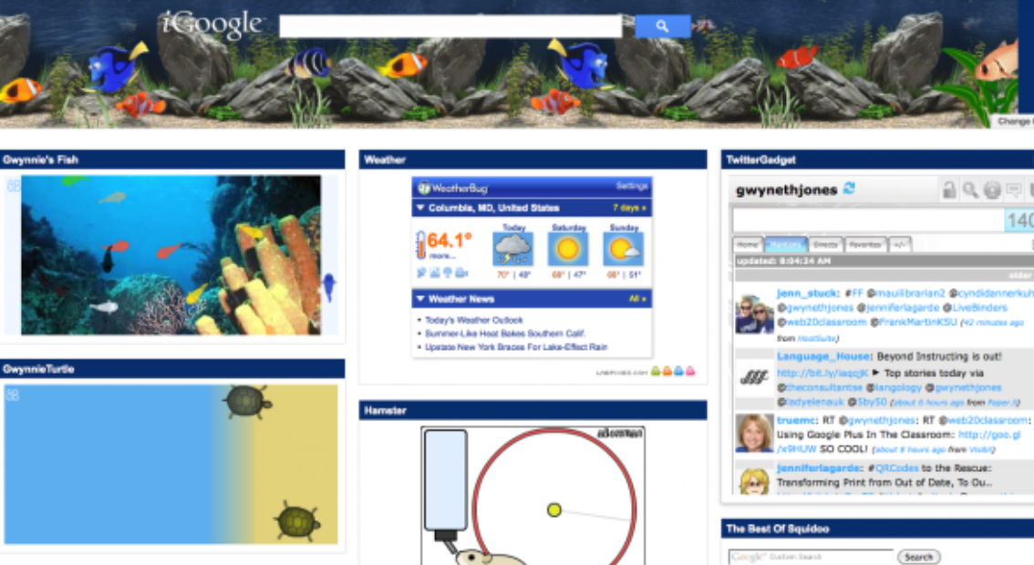
In the olden days, the common way to enable third-party content in one’s interface was by iframing. We commonly saw this in the nostalgic iGoogle and Facebook Canvas. Today other options are trending, but iframes are still common.
With what we have learned, in performance, security, and most importantly in my opinion, user experience, iframes are still relevant, when provided in a properly designed manner.
An Overview of IFrame Integrations
For iframe platforms, the integration can be fairly straightforward - the host service decides where partners integrations can be displayed, and has an iframe in that location, where a third party URL is provided.
And old and simple example would be iGoogle:

This was an alternative homepage which allowed a handful of third-parties to be displayed in a dashboard interface.
As a developer, the most basic integration is to specify that URL. Of course, deeper integrations are expected. And when they do, we need to ensure that the platform can scale. There are both design and technical aspects to plan ahead.

Design Principles: Provide an Experience That Fits the Dimensions of the Page
Some platforms enable near-full-screen integrations via iFrame. Even then, most have certain interfaces where the partner can only integrate within a defined space.
This is especially noticeable in Google’s G Suite where their integrated “add-ons” are restricted to a narrow portion of the UI, in the right sidebar.

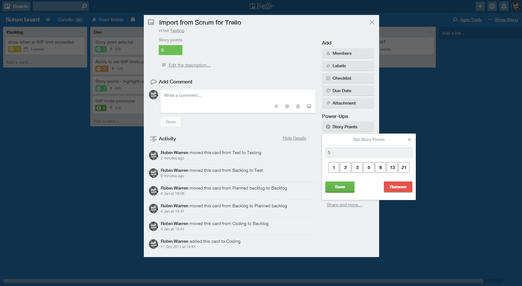
Trello, similarly with its “Power-Ups” integrations, positions partners within Trello cards.

Clearly, size matters when allowing partners to integrate in your UI.
Have a Design That Works Well with the Interface
Early versions of this model integrated for the sake of integrating. Many of us saw this prior and during the “2009 API Craze” when APIs “got cool” (not that any of us are hipsters, of course…).
The most extreme cases were “Webtops” - webpages that looked like desktop Operating Systems. They were free for all, and did not tell a [compelling story] or give users a reason to really use this.
Other platforms have a purpose: clear use cases where it makes sense for partners to complement the product. And, where a pattern can be found in which many partners can similarly work, an embed framework fits.
Trello is a great example of this. The team understands where third-party tools may fit in their interface - on cards, and on dashboards. They thought through the customer stories and flows, and made sure to enable those aspects of their interface [todo: clarify].
Box and Google Drive are great examples as well, with user scenarios translating to a different experience that fits their need. A core aspect of both these services is working with files. Although Google can edit documents, spreadsheets, presentations, and other files (Google Draw, Sites, etc), they let others plug right into the file management interface.
Establish Guidelines for Partners
Freedom and responsibility. These platforms find it more important to have design rules, or preferably, design guidelines.
Facebook’s canvas drove a trend in these integrations, but most related platforms were unsuccessful. While other articles delve into Facebook Canvas, and what worked and hadn’t worked, most agree that Facebook was too loose in what it allowed on the platform, allowing many integrated services to negatively affect the experience. For those of us old enough to remember getting inundated with Zombie Bite apps, we saw the challenge of an embed platform that’s too open.
Now, all embed frameworks have restrictions on what they will allow. Companies continue to test their rules, and depending on the industry and platform, some will have to be more restrictive than others. However, among the more successful frameworks, one finds the following pattern:
Less Rules, More Guidelines
Most platforms I encounter have design and technical guidelines, some more loose, some more strict. When it comes to design, the more consistent a partner’s design style is with the platform, the better the customer experience, and the more likely the integration would be featured by the platform provider.
Platform providers usually understand that many integrations have legitimate reasons for a less consistent UI in certain circumstances. Furthermore, some partners may be run by small teams, who can’t make a perfect app, but can solve an important problem for a few customers - and shouldn’t be held back if they can’t meet a perfect integration requirement. Other apps may appeal to a wider audience, and if meeting design guidelines, may be better promoted to customers.
Consequently, while certain platforms are strict in design requirements, others apply guidelines, recommending but not requiring that partners abide 100%.
Less Restrictions, More Incentives
To encourage custom branding, several platforms make development of a consistent UI easier, encouraging use of branding guidelines with positive motivation rather than forcing it. Such platforms may provide embeddable components to perform common operations in an iframe, so that partner don’t have to write as much code themselves.
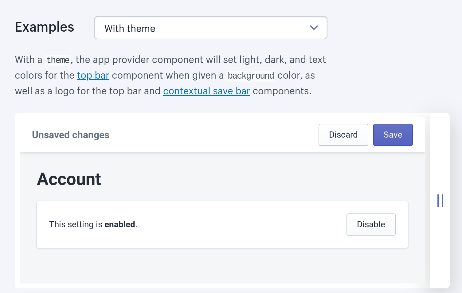
Shopify went this route with their Polaris Components - a library of UI components for developers to implement the UI of their applications easily, and with branding more consistent with Shopify’s interface.

Making development easier, by using tools that meet design guidelines, is win (user), win (developer), win (platform host).
Some go to a greater level, providing their own markup language and scripts. We delve into this more deeply in the next article.

Security Considerations for IFrames
We are now allowing apps to work with our data, and with our interface, so there are security matters to resolve before opening a platform to partners. Security seems like an obvious topic to handle early in planning, but I have been unpleasantly surprised enough times by platforms that didn’t fully consider security implications.
Many books are available on relevant security topics here, but here is a top 3 summary of considerations for iframe models:
- Cross Origin Requests: IFrames pages from third-parties are by default blocked from making calls to third party servers. The most common solutions is enabling CORS, while some apply somewhat hacky solutions with API proxies (call a same-origin server and make server-to-server API calls) or JSONP.
- Iframe page access: Newer access and permission settings are permissible with HTML5 since to place a greater level of control over iframes. The “sandbox” attribute can restrict iframe content from running scripts, launching popups, and performing other operations not deemed secure or UI friendly. This also gives a better sense of comfort to enterprise services, and others who just care more about safely managing integrations.
- SSL: As long as your service is SSL enabled, non-SSL content cannot be displayed in an iframe on most popular browsers. There was once an event a few platform friends called the “SSL-pocalypse,” when SSL wasn’t expected on all sites, and security rules were more relaxed. It was possible for a non-SSL page to be embedded in an SSL page in some browsers, but today it’s no longer the case - a logical rule for security.
Looking Beyond
iFrames alone can take UI integrations a long way. In its early days they struggled, due both to technology limitations and a lack of design thought. When applying proper Product Management and Design principles, the most basic technology to integrate can work. However, after use cases are considered, the technology needs to fit, and there are many technical intricacies to consider for iframes.
In the process, many platform teams applied alternative means to enable integrations in their interfaces. But it helps to understand iframes first, along with supplementary and complementary options.


